Loading

Back to Portfolio
Case Study
Showcase case · Not a client projectDental Clinic Brand Website — Sunny Dental
A reassuring patient experience woven from white and navy
多頁式網站Next.jsTailwind CSS醫療診所品牌形象
Visit Website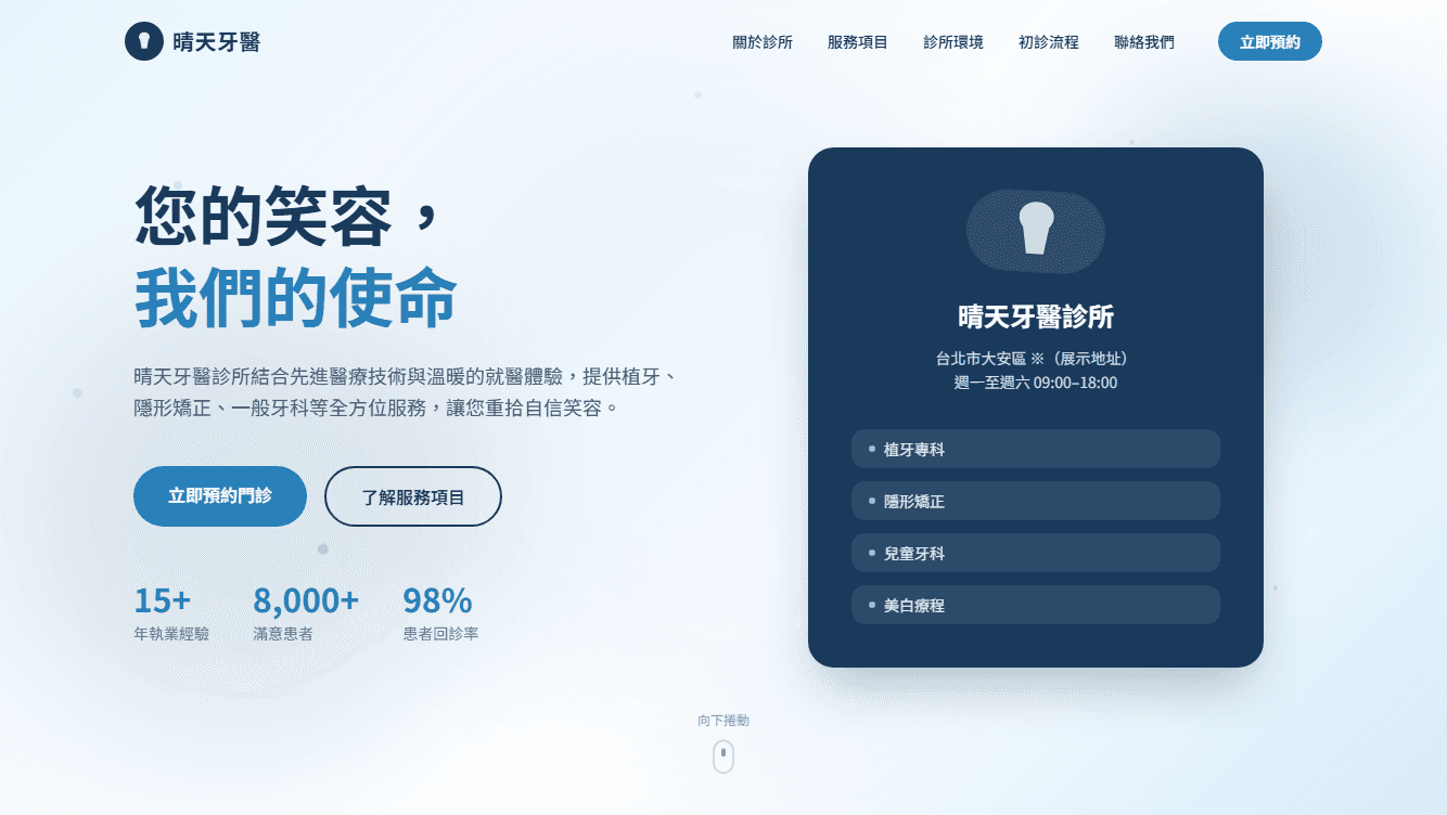
Industry
Medical / Dental Clinic
Project Type
Multi-Page Brand Website
Tech Stack
Next.jsTailwind CSSRWD
Scope of Work
Visual designInformation architectureMulti-page developmentResponsive design
Screens
Screens from the live site
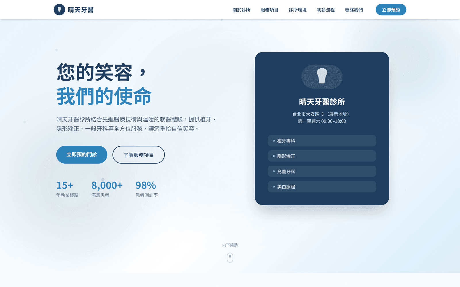
DesktopSunny Dental concept hero with the clinic positioning, service card, and booking button (On-screen names, figures, and copy are placeholder data.) 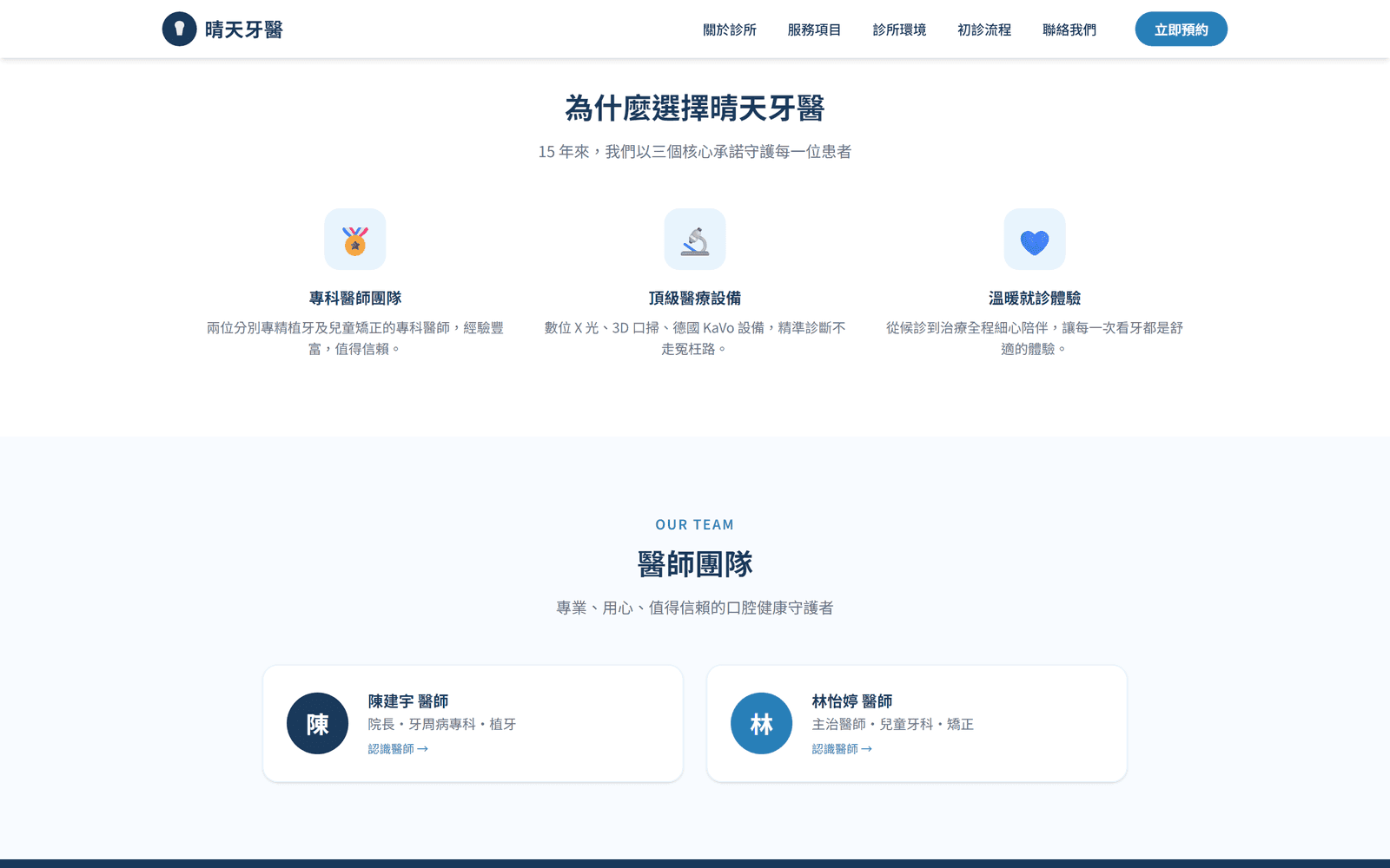
DesktopClinic highlights and doctor profiles, demonstrating trust-building for a multi-page healthcare site (On-screen names, figures, and copy are placeholder data.) 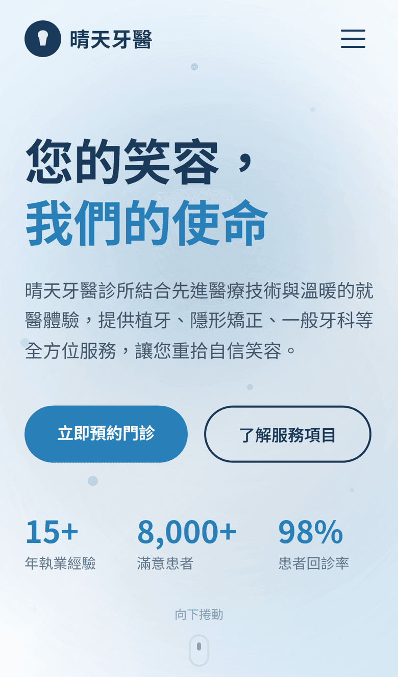
MobileMobile layout showing services and the first-visit flow on a small screen (On-screen names, figures, and copy are placeholder data.)
Overview
Overview
Sunny Dental is a brand website for a family-oriented dental clinic. For a medical practice, the website is more than a storefront — it's the first trust checkpoint where patients decide whether they dare to walk in, especially those anxious about dental visits.
The project maps out the clinic's full digital presence across multiple pages: services, doctor profiles, a first-visit guide, and online booking — using clear information and gentle visuals to deliver a sense of reassurance to every visitor.
Challenge
The Challenge
Calibrating visual trust for healthcare
An overly commercial design erodes professionalism; a cold clinical look heightens patient anxiety. The design had to strike a precise balance between expert and approachable.
Organizing many services
From general dentistry to whitening and orthodontics, the services needed careful categorization and navigation so every patient finds answers fast.
Lowering the barrier to a first visit
Many patients delay care simply because they don't know what to expect. The website had to proactively answer 'what happens on my first visit?'
Solution
The Solution
A white-and-navy trust palette
Generous whitespace paired with navy blue conveys a clean, professional, trustworthy medical image, softened with gentle accent tones to feel approachable.
Patient-first multi-page architecture
Content is split into services, doctor team, first-visit guide, and booking — each page focused on answering one class of questions, all interlinked.
A visualized first-visit flow
The first visit is broken into clear step-by-step explanations, so patients know exactly what happens before they arrive — effectively reducing anxiety.
Booking within reach everywhere
Every page offers one-click access to booking, shortening the distance from 'I should see a dentist' to an actual appointment.
Highlights
Highlights
Service pages
Each treatment presented on its own page, explained in plain, accessible language.
Doctor team
Full introductions of credentials and specialties, building familiarity and trust before the visit.
First-visit guide
Step-by-step explanation from registration to treatment — first-timers know the whole flow in advance.
Online booking flow
Multiple booking entry points across the site guide browsing naturally toward an appointment.
Brand visual system
A consistent white-and-navy visual language that builds a clean, professional brand impression.
Responsive design
Smooth browsing on phone, tablet, and desktop — patients can check and book anytime.
Outcome
What the showcase demonstrates
- A white-and-navy palette that demonstrates a clean, professional, and approachable medical visual style
- A first-visit flow broken into clear steps, showing one way to reduce pre-visit uncertainty
- A multi-page structure that leaves room to grow — patient education articles, case sharing, and more
This page is a showcase case used only to demonstrate information architecture and design approach for healthcare websites. It does not represent any real clinic, doctor, or medical service, and includes no patient counts, booking growth, or search ranking data.
GET STARTED
Want a website like this?
Share your current services, reference sites, and the features you need — SimpleCreative will confirm a suitable page structure and build approach.