Loading

Back to Portfolio
Case Study
Live projectPersonal Trainer Website — PETER
A one-page personal brand website that makes expertise visible
一頁式網站Next.jsRWD個人品牌Tailwind CSS
Visit Website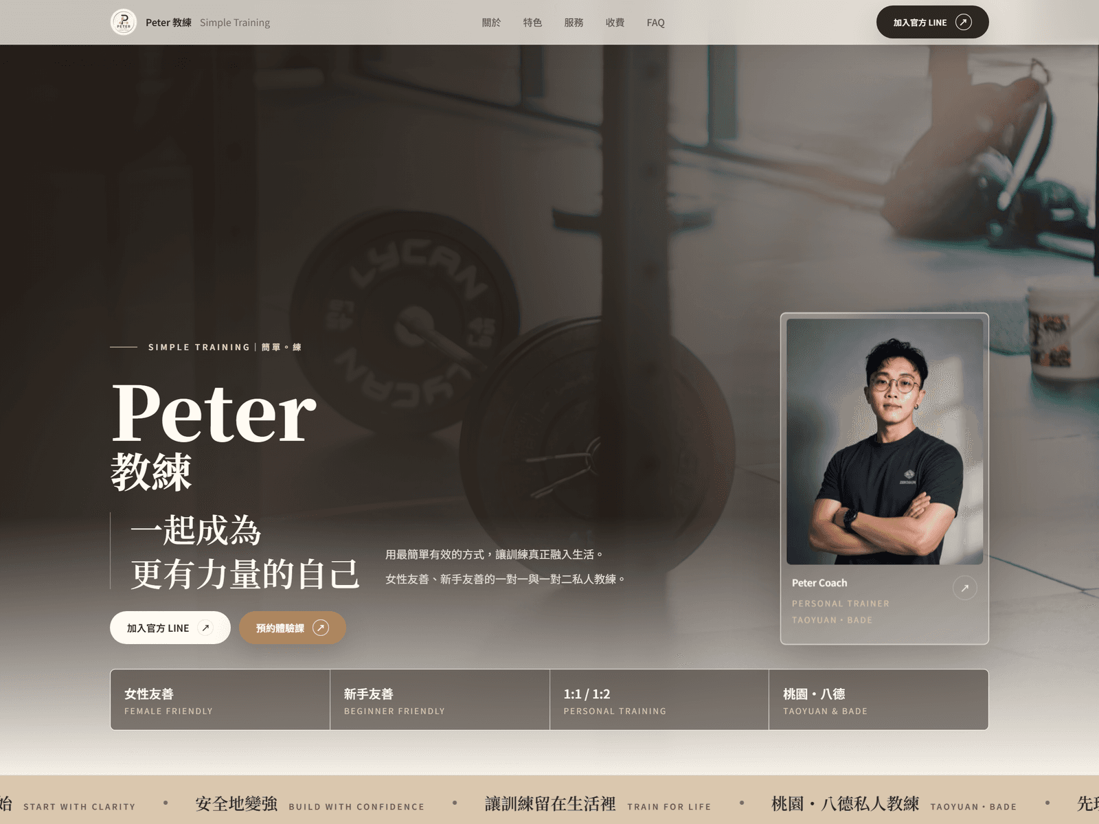
Industry
Personal Trainer
Project Type
One-Page Personal Brand Website
Tech Stack
Next.jsTailwind CSSRWD
Scope of Work
Brand visual directionWeb designFront-end developmentResponsive design
Screens
Screens from the live site
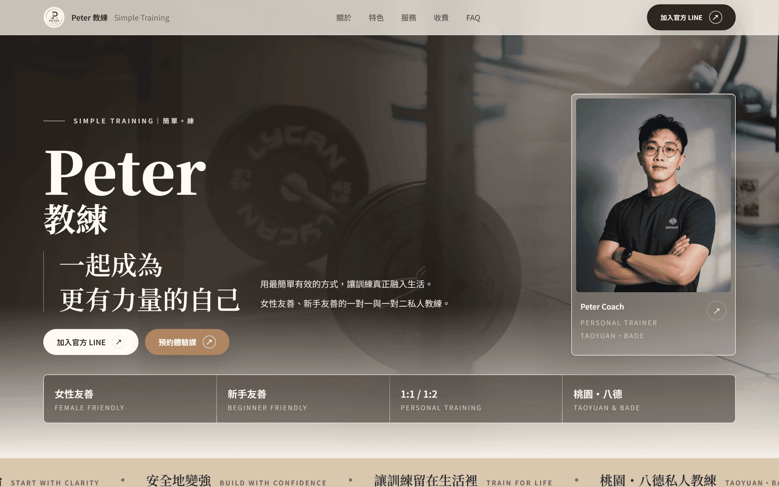
DesktopPETER trainer site hero with the coach photo, positioning statement, and trial-session button 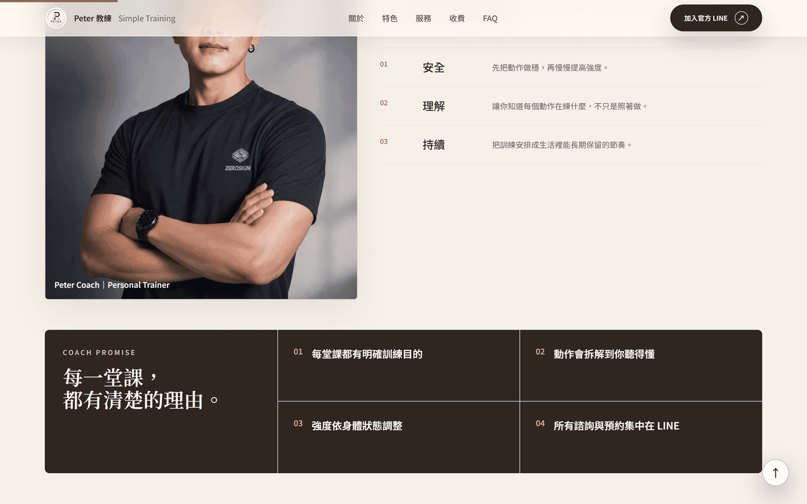
DesktopProgramme section covering the coaching approach, package contents, and training locations 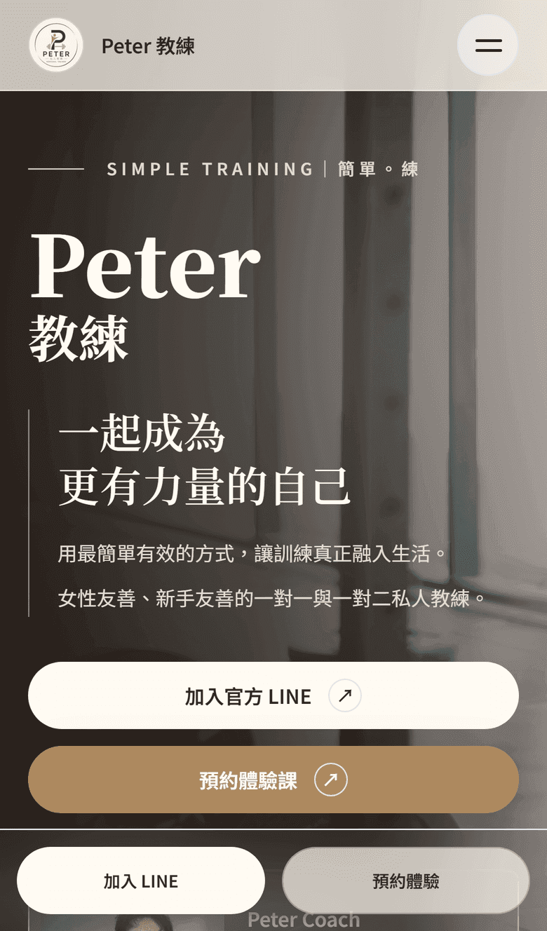
MobileMobile one-page flow moving from the introduction through packages to contact
Overview
Overview
PETER is a personal trainer with years of coaching experience. His clients came mainly through word of mouth and social media — but a social feed can never fully present a coaching philosophy or service details, so prospects had to piece things together through long message threads.
The goal of this project was to build PETER a one-page website that works like a digital business card and enrollment brochure in one: letting a stranger understand his coaching style, packages, and client results within minutes — and reach out directly.
Challenge
The Challenge
From social presence to brand identity
Existing material was mostly casual social media photos. The visual style needed a reset to present a consistent, credible professional image.
Building trust and converting in a single page
The visitor's journey from 'never heard of him' to 'ready to inquire' had to complete within one page — content order and pacing were everything.
Mobile is the battleground
Nearly all traffic comes from the link in his social profiles, so the mobile experience directly determines results.
Solution
The Solution
A narrative enrollment flow
The page unfolds as 'philosophy → packages → testimonials → inquiry,' simulating a full first consultation and building trust with every scroll.
Personal brand visual direction
Professional portraits of the coach anchor the visuals, paired with calm colors and generous whitespace to project trustworthy expertise.
One clear call to action
The entire site converges on a single goal — starting an inquiry. Every section flows naturally toward the contact entry point.
Highlights
Highlights
Coaching philosophy
First-person storytelling that introduces the person before the first meeting.
Service packages
Programs and package differences explained once, clearly — cutting repetitive Q&A.
Client testimonials
Real client feedback that vouches for coaching quality and accelerates trust.
Inquiry funnel
Clear calls to action and contact entry points let interested visitors reach out immediately.
Entrance animations
Refined scroll and entrance animations that add polish and pacing to the browsing experience.
Responsive design
Designed mobile-first, so social traffic lands on a seamless experience.
Outcome
The Outcome
- A single official entry point that social and Google traffic can be pointed at, replacing scattered post links
- Packages, training locations, and pricing are written out on one page that can be shared directly with enquirers
- A responsive desktop and mobile layout with the trial-session contact path built in
For trainers, consultants, and freelancers, a one-page website is the most efficient digital business card there is — this project shows how to explain your expertise and build trust within a single page.
GET STARTED
Want a website like this?
Share your current services, reference sites, and the features you need — SimpleCreative will confirm a suitable page structure and build approach.