Loading

Back to Portfolio
Case Study
Live projectFitness Studio Website — Slow Practice Room
A brand website built around the philosophy of 'train slowly, go the distance'
一頁式網站Next.jsRWD健身工作室Tailwind CSS
Visit Website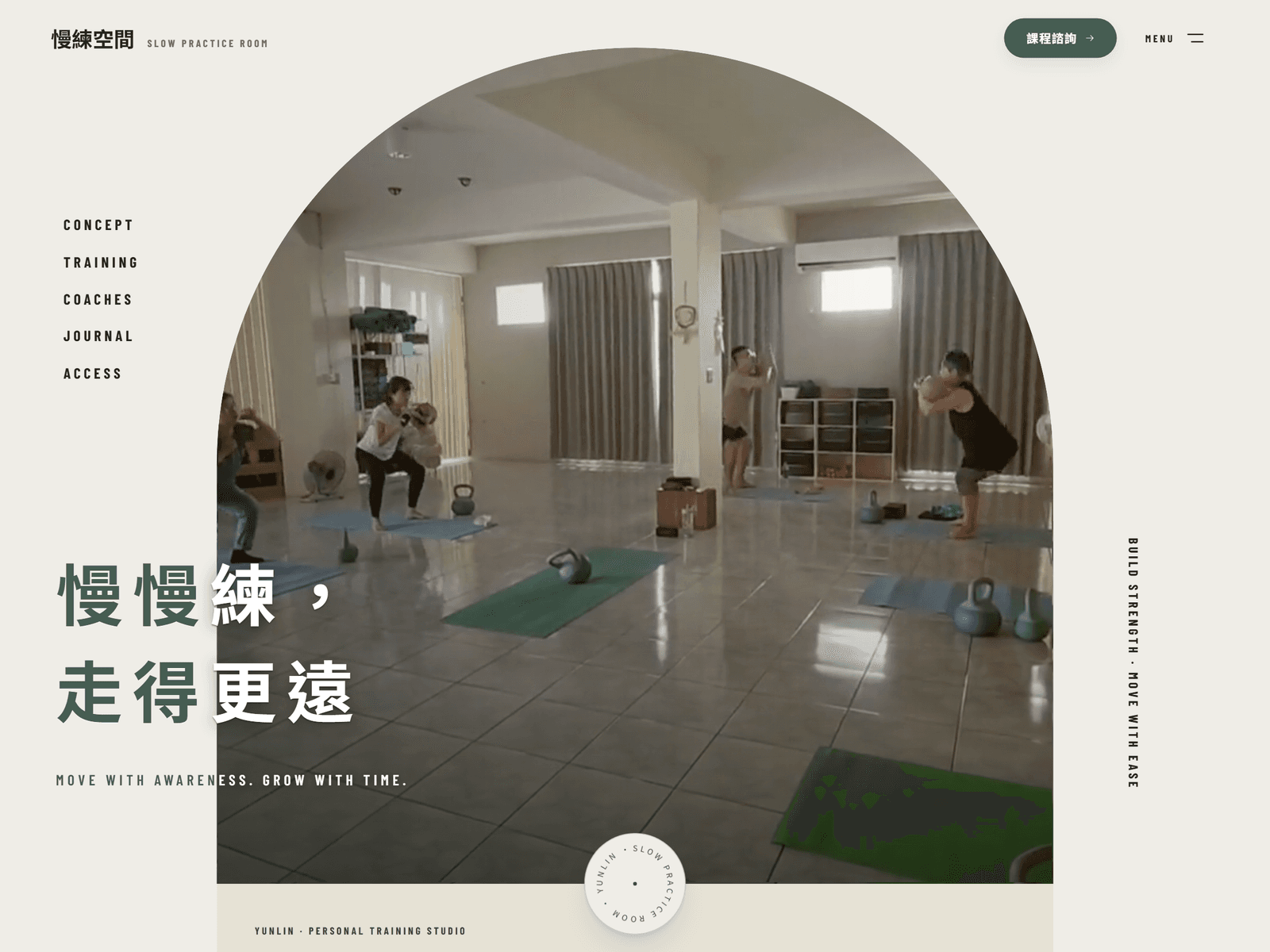
Industry
Fitness Studio
Project Type
One-Page Brand Website
Tech Stack
Next.jsTailwind CSSRWD
Scope of Work
Visual designFront-end developmentResponsive designDeployment
Screens
Screens from the live site
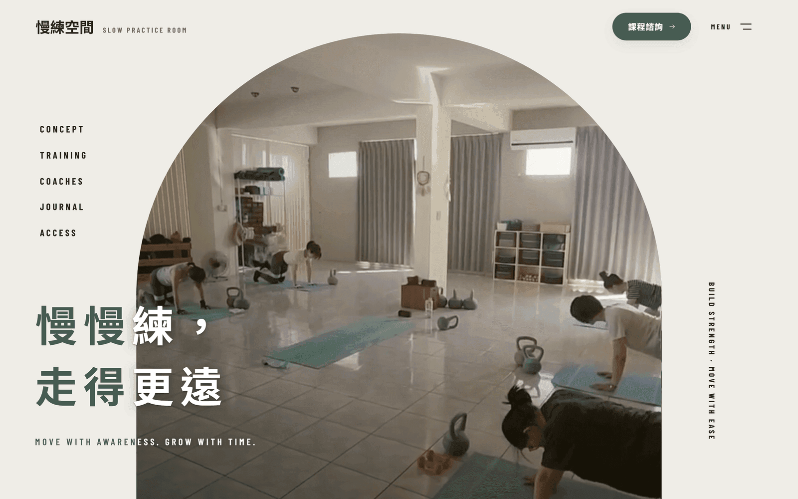
DesktopSlow Practice Room homepage hero with the studio motto and a photo of the training space 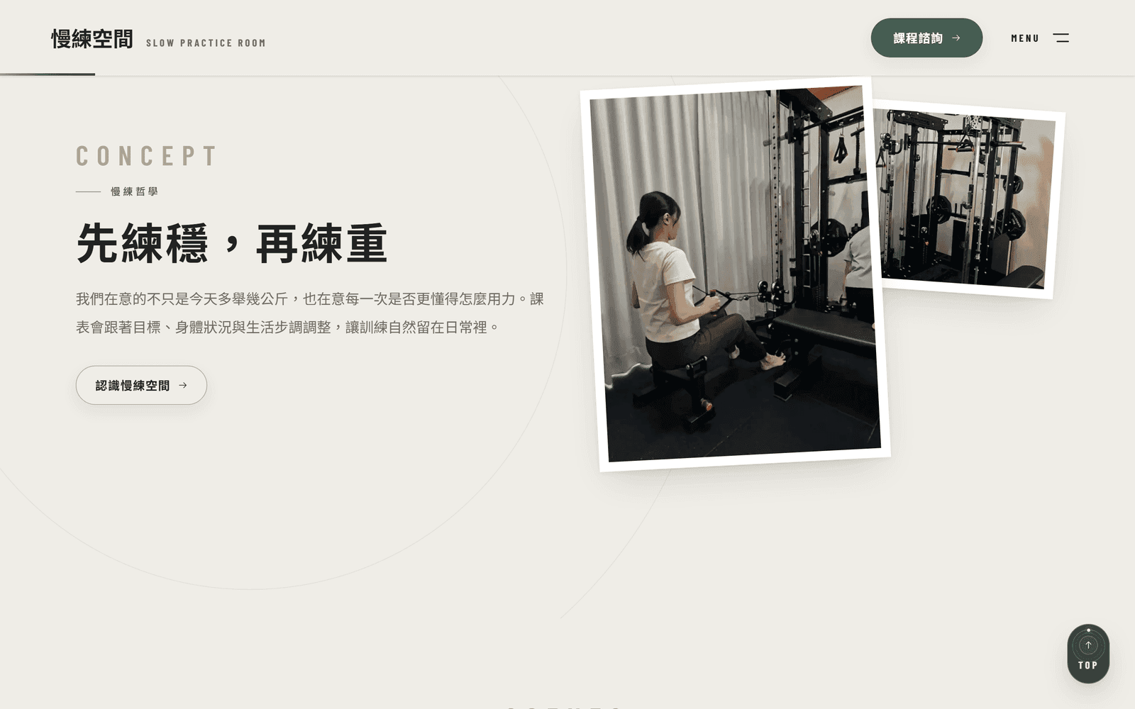
DesktopTraining philosophy section explaining how programmes adapt, alongside photos of the space and equipment 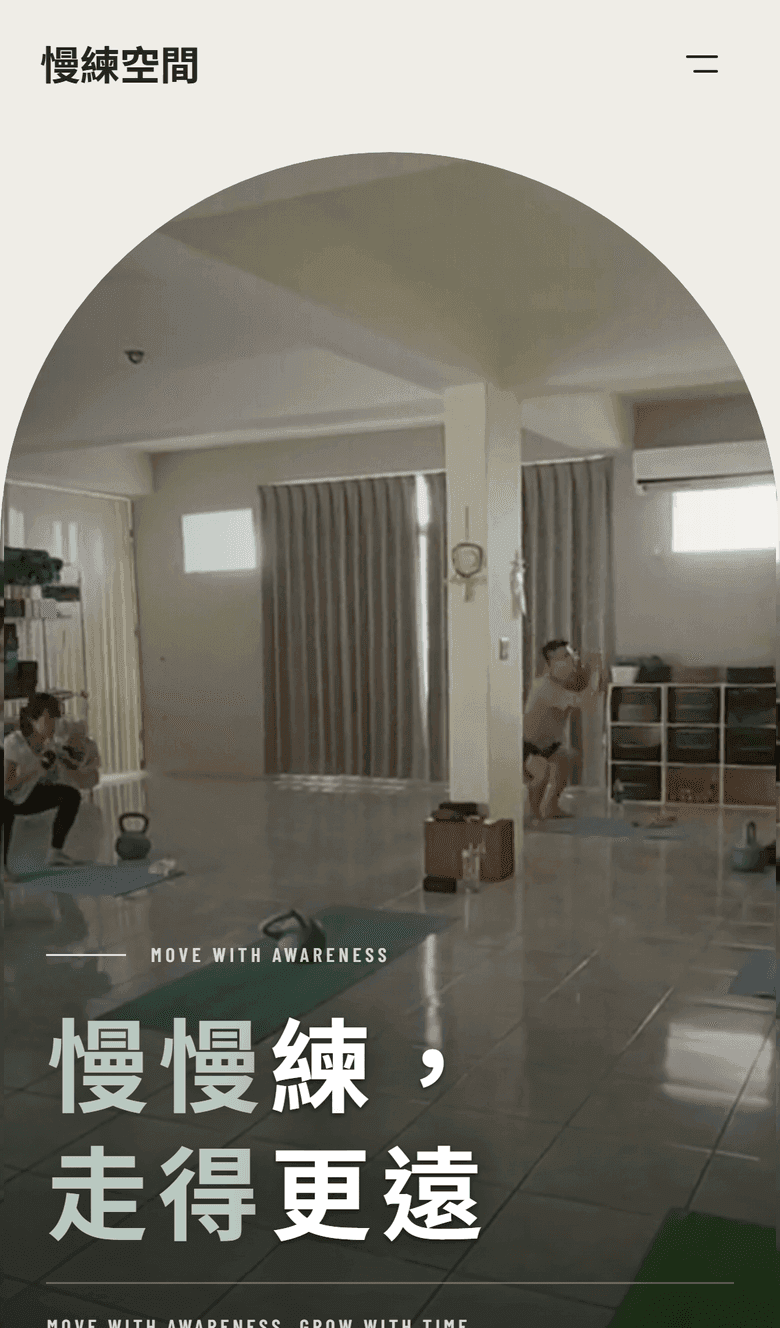
MobileMobile homepage: the motto, navigation, and the class enquiry entry point
Overview
Overview
Slow Practice Room is a fitness studio built on the belief of 'train slowly, go the distance.' Unlike gyms that chase quick results, they see training as a lifelong practice — movement quality over numbers on the bar, long-term habits over short-term bursts.
Before the website, information about the studio was scattered across social media posts: class formats, coach backgrounds, the training space itself. New students had to piece it together on their own. The goal of this project was to build one official home that communicates the philosophy, gathers everything in one place, and makes taking the first step feel safe.
Challenge
The Challenge
A philosophy that resists slogans
'Slow practice' runs counter to mainstream fitness culture. A tagline alone can't carry its value — visitors need to feel it through the storytelling of the whole page.
Standing apart from big-box gyms
Large gyms compete on equipment and price. A studio wins on coaching quality and personal attention — the website had to make that human warmth visible.
Mobile-first traffic from social media
Nearly all prospective students arrive from Instagram or LINE on their phones, so mobile readability and load speed decide everything.
Solution
The Solution
A narrative one-page structure led by philosophy
The site opens with the brand story and flows through 'philosophy → classes → coaches → space → booking' — visitors read on naturally, as if the studio were introducing itself in person.
Real photos to build trust
No generic stock imagery. The entire site uses photos of the actual training space and coaches, so what students see on arrival matches the website exactly.
Mobile-first design and performance tuning
The layout was designed for mobile first, with Next.js image optimization and restrained animation, so the first impression from social traffic is instant and smooth.
Highlights
Highlights
Brand story section
Large statements paired with narrative copy that fully articulates the 'train slowly, go the distance' philosophy.
Class introduction
Class formats and target audiences presented clearly, helping students find the right starting point fast.
Coaching team
Backgrounds, certifications, and teaching styles at a glance — meet the coach before walking into the studio.
Space showcase
Photos of the real training space convey the studio atmosphere and equipment setup.
Booking funnel
A clear booking entry point at the end of every section turns browsing into class inquiries.
Responsive design
Optimized layouts for phone, tablet, and desktop, with a smooth mobile experience.
Outcome
The Outcome
- The brand philosophy went from scattered social posts to one complete, shareable official home
- Classes, coaches, the space, and how to enquire now live on one page that can be read before visiting
- A responsive mobile and desktop build that can be used directly as a landing page for social and ad traffic
This project shows how a one-page website can build a complete brand narrative for a small studio — it doesn't take many pages, just the right content order and a clear call to action.
GET STARTED
Want a website like this?
Share your current services, reference sites, and the features you need — SimpleCreative will confirm a suitable page structure and build approach.